| The user guide is also available in the Eclipse Help (via menu and it can be downloaded as a PDF. |
This user guide describes how to use the Platform Performance Suite (PPS). PPS provides insight in software execution over time and enables automatic performance diagnostics. Various generic analysis techniques like critical path, root-cause, outlier identification analysis can be applied to the Timed Message Sequence Chart (TMSC) model. The TMSC-models, as well as the results of the analysis, are presented to the user by various visualizations focusing on facilitating the diagnosis at specific abstraction levels.
1. PPS Workbench
PPS is an Integrated Development Environment (IDE) based on Eclipse. For common information about the Eclipse Workbench, please read the Eclipse user guide. The figure below shows a screenshot of the PPS IDE with the most important editors and views for PPS. The remainder of this section explain these views.
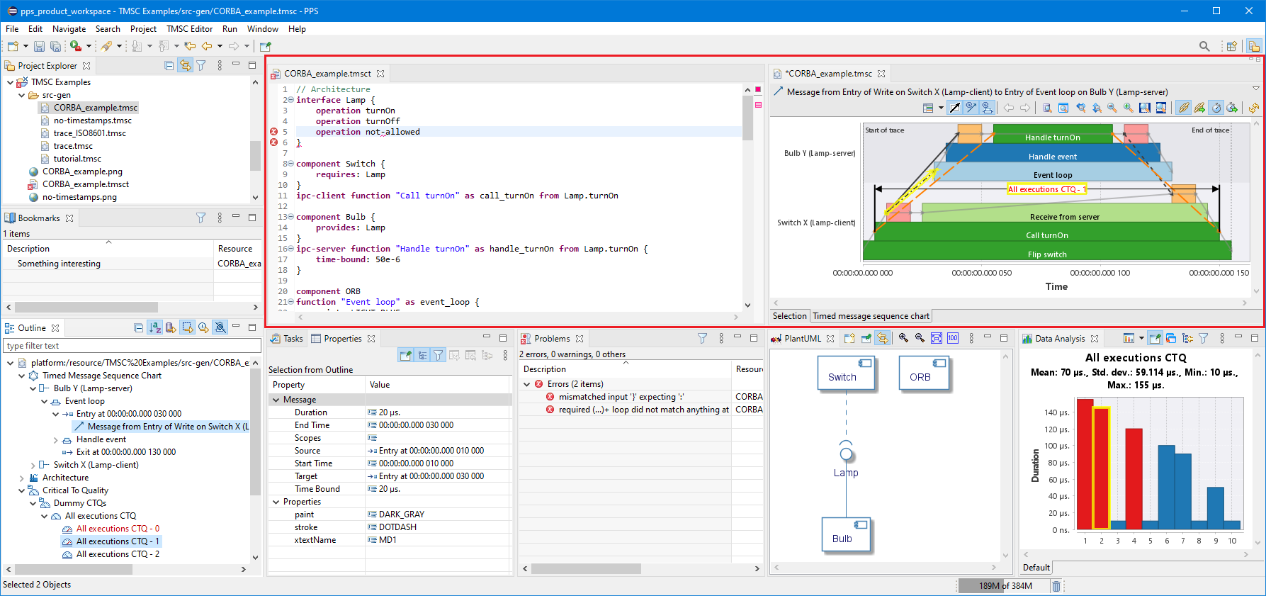
- Project Explorer view
-
Within Eclipse, the files to work with are part of a project. The available projects are shown in the Project Explorer view. Each project is simply a directory on the hard disk, and can be expanded to show the files and directories it contains. By double clicking a file, it is opened in the editor area by the default editor that is associated with that file.
The files in the Project Explorer view support contextual actions by means of the Context menu. The supported actions for a file are explained in more detail in the section of the editor that is associated with that file.Toggling the  Link with Editor button in the Project Explorer view toolbar ties the view to always show the current file being edited.
- Editor area
-
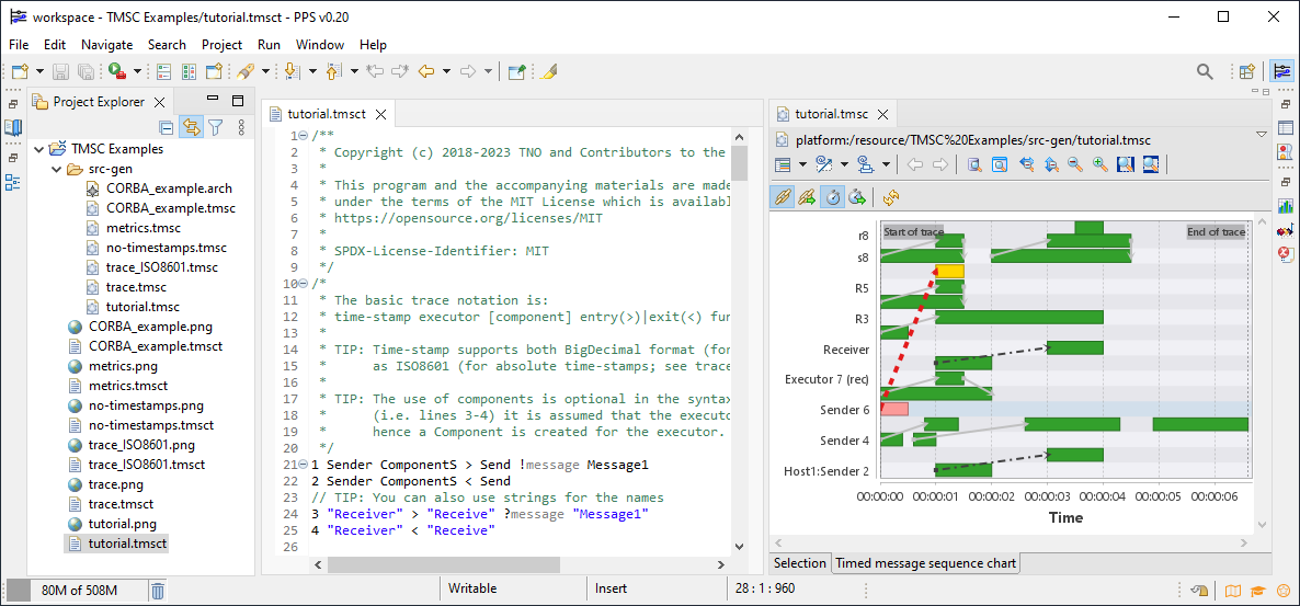
The editor area is marked as a red rectangle in a screenshot of the PPS IDE. In the screenshot, the editor area contains two editors side-by-side. By default editors will be opened stacked, but editors can be moved by means of dragging the tab of an editor to another location.
The left editor shows the TMSC textual editor and the right editor shows the TMSC graphical viewer, that both are explained in more detail in their corresponding sections.Opening a textual editor and graphical viewer side-by-side is useful as the changes in the textual editor will be reflected in the graphical viewer upon save.
- Bookmarks view
-
Bookmarks are a simple way to navigate to resources that are used frequently. The Bookmarks view displays all bookmarks in the Workbench.
- Outline view
-
The Outline view displays an outline of a structured file that is currently open in the editor area, and lists structural elements. The contents of the Outline view are editor specific and therefore explained in more detail in the section of its editor.
- Properties view
-
The Properties view displays property names and values for a selected item such as a
Messagein a screenshot of the PPS IDE. The contents of the Properties view are editor specific and therefore explained in more detail in the section of its editor.By default the Properties view is stacked behind the Tasks view.
- Problems view
-
As you work with resources in the workbench, various builders may automatically log problems, errors, or warnings in the Problems view. For example, when you save a textual TMSC file that contains syntax errors, those will be logged in the Problems view. When you double-click the icon for a problem, error, or warning, the editor for the associated resource automatically opens to the relevant place.
By default the Problems view is stacked behind the Tasks view.
- PlantUML view
-
The plantuml library implements a DSL and renderer for many UML diagrams (class, sequence, objects, states, activities, …). See http://plantuml.com for more info about the DSL and renderer. The PlantUML view integrates plantuml’s functionality into Eclipse and displays contextual UML diagrams for a selected item such as an
Architecturein a screenshot of the PPS IDE. The contents of the PlantUML view are editor specific and therefore explained in more detail in the section of its editor.
- Data Analysis view
-
The Data Analysis view displays statistical information for a selected item such as a Time series viewer for a
metric instancein a screenshot of the PPS IDE. The contents of the Data Analysis view are editor specific and therefore explained in more detail in the section of its editor.By default the Data Analysis view is stacked behind the PlantUML view.
1.1. Preferences
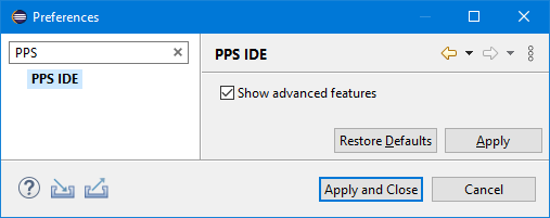
Use the command Preferences dialog pages to set how you want Eclipse to operate. The menu path is on Windows and Linux - on macOS the Preferences can be found in the App menu. The filter input at the left top can be used to easily navigate to the PPS settings.
| The 'Show advanced features' option enables experimental features in PPS. These features may be unstable, undocumented and might produce unexpected results. All editors should be closed and re-openend after changing this setting for the changes to take effect. |
2. TMSC textual editor
The TMSC textual syntax allows you to create small example traces, to explore, test or document PPS features. The textual syntax is not developed for large traces as it will suffer from scalability issues. For large traces a custom TMSC reconstructor should be implemented as documented in the PPS developer guide.
The TMSC textual editor provides syntax highlighting and code completion to support writing TMSCs.
It also provides means to customize the visualization of the TMSC by e.g., defining colors for executions and dependencies.
All features of the syntax are explained in the comment that are included in the tutorial.tmsct file that is part of the TMSC examples project as provided by PPS.
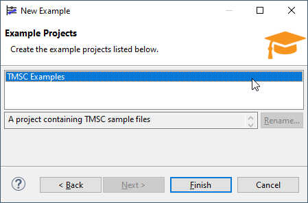
Use the menu and choose the TMSC Examples Wizard to add this TMSC examples project to your PPS workspace.
Then click the Finish button to complete the import.
|
During import the following question may pop up.
You may want to check 
|
When the wizard is done, the tutorial.tmsct file is automatically opened in the editor area.
Upon a save of a *.tmsct file, a *.tmsc file with the same name is automatically generated in the src-gen folder within the project.
This TMSC file can be opened with the TMSC graphical viewer.
|
Toggling the |
In the screenshot below, the editor area contains the TMSC textual editor and the TMSC graphical viewer side-by-side. By default editors will be opened stacked, but editors can be moved by means of dragging the tab of an editor to another location. Opening a textual editor and graphical viewer side-by-side is useful as the changes in the textual editor will be reflected in the graphical viewer upon save.
3. TMSC graphical viewer
The runtime behavior and timing of software applications can be visualized using Timed Message Sequence Charts (TMSC). Various generic analysis techniques like critical path, root-cause, outlier identification analysis can be applied to the TMSC model. To learn more about Timed Message Sequence Charts, please read section Timed Message Sequence Charts.
The TMSC *.tmsc or *.tmscz files can be viewed by using the TMSC graphical viewer.
By double clicking on a TMSC file, this viewer opens.
After opening the viewer, the viewer starts loading the model.
Once the model is loaded, the viewer is filled with the data from the model.
The editor features various views, each with a different purpose, namely:
-
Project Explorer View (detached)
-
Outline View (detached)
-
Selection View (tab)
-
Timed Message Sequence Chart View (tab)
-
PlantUML View (detached)
-
Data Analysis View (detached)
3.1. Timed Message Sequence Charts
The runtime behavior and timing of software applications can be visualized using Timed Message Sequence Charts (TMSC). In a TMSC, executors are shown on as horizontal swimlanes, and (real) time is shown along the horizontal axis. The labels of the executors are shown on the vertical axis. An executor is a single threaded computational resource with run-to-completion semantics. The function calls that are executed by an executor are shown as bars within its swimlane and are called executions. The bars are labeled with the function name. Nested function call executions are drawn as stacked bars, resulting in a call stack. Arrows between the bars denote the data and control flow dependencies. The arrows indicate where executors are communicating with each other. Section Relations to (Message) Sequence Charts and Flame Graphs compares TMSCs to similar representations.
Section TMSC view shows an example visualization.
3.1.1. Relations to (Message) Sequence Charts and Flame Graphs
To give some more intuition about Timed Message Sequence Charts, they are compared to similar representations.
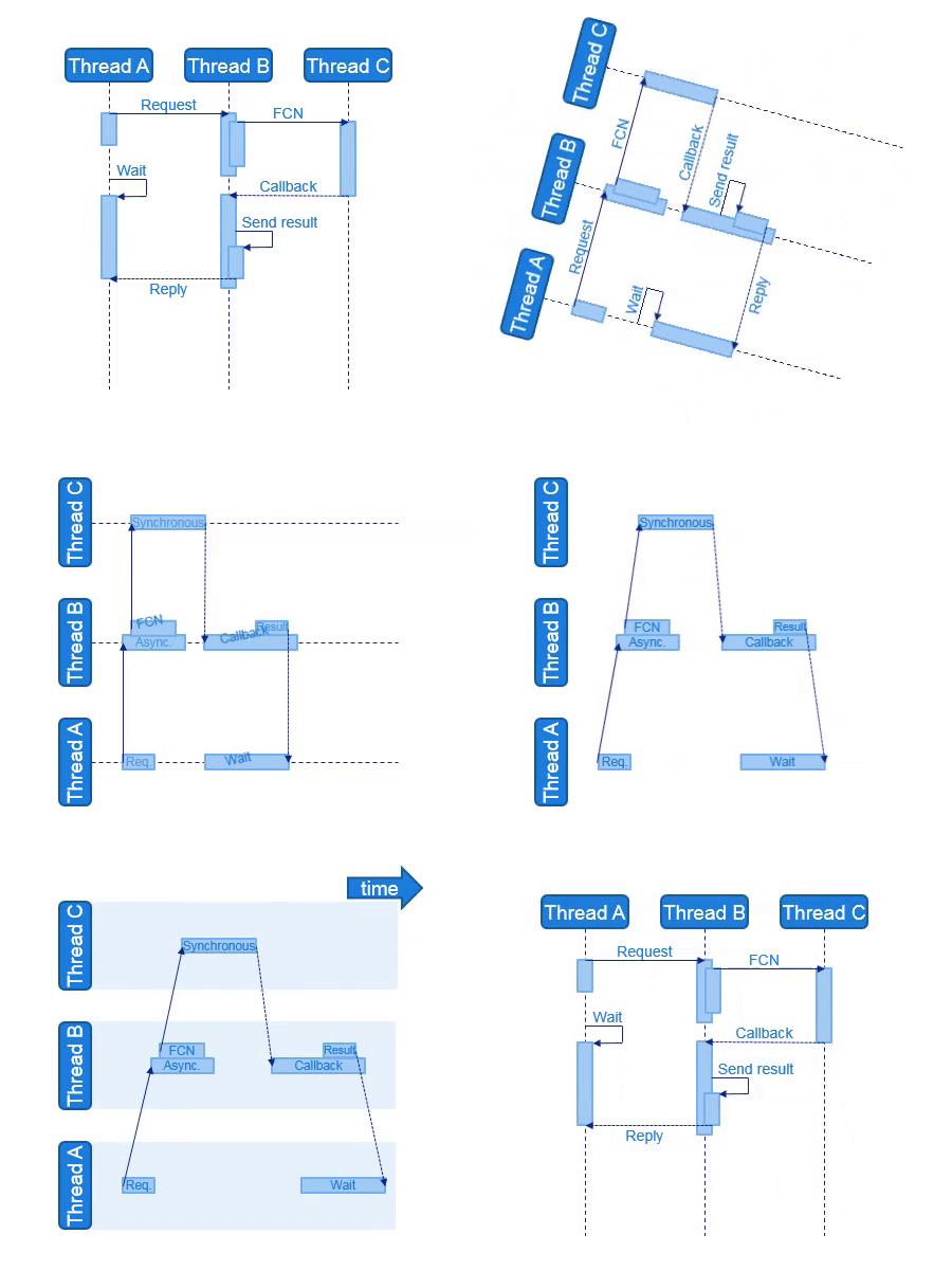
Timed Message Sequence Charts are similar to UML Sequence Diagrams and SDL Message Sequence Charts. The main differences are:
-
The horizontal axis and vertical axis are swapped such that life-lines are positioned horizontally, and the vertical axis shows the life-line labels.
-
The life-lines represent autonomous execution entries, similar as in SDL.
-
Life-lines are shown as swim-lanes.
-
Arrows represent asynchronous messages, i.e. the sending executor continues execution directly.
-
Overlapping executions are drawn as stacked boxes, instead of overlapping boxes.
-
Labels are shown inside the executions, instead of on the arrows.
-
The horizontal axis shows the (real) time, such that the length of an execution represents the actual duration of that execution, and the distance between the start and the end of an arrow represent the latency of message passing.
-
Fragments, such as loops, alternatives and references, are not allowed in Timed Message Sequence Charts.
These differences are illustrated with the animation below.
Timed Message Sequence Charts are also similar to Call Charts or Flame Charts. It can be argued that Timed Message Sequence Charts have a Flame Chart for each executor. These Flame Chart are connected by arrows to show inter-executor relations. Note that, Flame Charts should not be confused with Flame Graphs, Flame Graphs put the alphabet on the horizontal axis instead of the time, see Brendan Gregg’s pages.
3.1.3. Critical Path Analysis
The TMSC also allows more advanced analysis like critical path analysis. Critical path analysis is always applied on the full TMSC.
A transitive reduction is applied on the TMSC before the analysis is performed. In short this means that all path segments which are superfluous are removed.
Critical path analysis to an event can be applied by following the TMSC dependencies in their opposite direction, only taking the route of dependencies with the shortest duration.
The description above is a very simplistic summary of a much more sophisticated algorithm as described in this paper: Inferring Timed Message Sequence Charts from execution traces of large-scale component-based software systems. The algorithm as described in the paper is used as base for implementation.
3.1.4. Metric Analysis
The TMSC metric analysis allows to validate whether timing requirements are met for predefined metrics. Currently, metrics and their budgets can be defined programmatically by means of implementing an extension point as described in the PPS developer guide. When a metric is analyzed, this results in a sequence of metric instances, one for every occurrence found. Each metric instance has a duration and all metric instances are analyzed to mark instances that exceed their budget.
3.1.5. Root cause analysis
| The functionality as described in this section still needs to be formalized in a paper. This section will be updated when the paper is available. |
| Please read section On Activities and Paths prior to this section. |
Automatic root cause analysis can automatically detect if a metric instance was delayed by either resource contention and or service contention. This section explains the detection algorithm on a high level.
Service contention basically means that an activity cannot execute as fast as possible because it is delayed by another activity which uses the same services. To detect this, two ingredients are needed: the critical path and the activity TMSC, both between the start and end of a metric instance. We can now say that all critical TMSC dependencies which are not part of the activity TMSC are caused by service contention.
Resource contention basically means that an execution within an activty takes more time than normal, but what is 'normal'. For metric instances multiple instances can be found within a trace. Typically these metric instances execute the same software functions in the same sequence, what we call repetitive behavior. We can use this repetitive behavior to determine the 'normal' execution time for each function within a metric instance. Outlier detection based on the interquartile range, with a multiplicand of 3.0, is used to detect resource contention.
3.2. Project Explorer view
The tmsc and tmscz file extensions are associated with the TMSC graphical viewer.
These files support the following contextual actions:
| Icon | Action | Description | ||
|---|---|---|---|---|
|
Analyze metrics… |
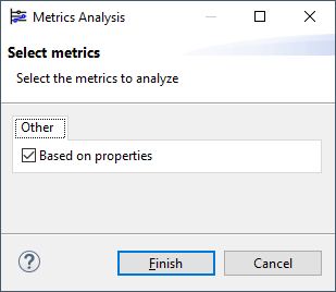
Starts metric analysis for the selected TMSC, please read section Metric Analysis for more information. When clicked, a wizard is presented to select the metrics to analyse. When done, the analyzed metrics and their resolved instances are saved in the TMSC. When the TMSC is opened in the TMSC graphical viewer the metrics and their resolved instances are visible in the Outline view.
|
||
|
Time-shift… |
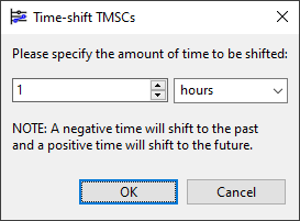
The time-shift function can be used to correct all times in a TMSC file by applying an offset. When clicked, a dialog is presented to specify the amount of time to shift.
|
3.3. Outline view
|
The Outline view supports dynamic filtering of its elements, by means of entering a search pattern in its filter text box. |
The Outline view shows the model in a tree view. Clicking an element in the tree selects the element and shows the details of that element in the Properties view.
By selecting elements in the tree both the resource and time context of an editor view can be reduced, see also Section dynamic inclusion filtering.
With reduction of the resource context is meant that the editor area will show only content which is related to the selected Outline elements.
For example, when a life-line is selected, the TMSC view view will only show this life-line and the life-lines that it directly communicates with.
This feature is active if the ![]() Push Context toggle bottom is selected.
Push Context toggle bottom is selected.
When the ![]() Push Time Range toggle button is selected, the editor area will automatically show the time range which includes the time context for the selected Outline elements.
Push Time Range toggle button is selected, the editor area will automatically show the time range which includes the time context for the selected Outline elements.
The model elements in the content outline tree support the following contextual actions:
| Elements | Icon | Action | Description | ||
|---|---|---|---|---|---|
TMSC |
|
Analyze metrics… |
Starts metric analysis for the selected TMSC, please read section Metric Analysis for more information. When clicked, a wizard is presented to select the metrics to analyze. When done, the analyzed metrics and their resolved instances are visible in the Outline view and can be saved using the menu.

|
||
TMSC |
|
Analyze slack |
Performs slack analysis on the selected TMSC, read section Slack Analysis for more information. When done, the rendering strategy is changed to the slack rendering strategy to show the calculated slack. |
||
Scoped‑TMSC |
|
Save as TMSC |
Saves the scoped TMSC, including its child scopes, into a new file, retaining only the elements of the TMSC that are required to store the scoped TMSC. This allows the user to only store a small portion of a larger TMSC. |
||
Metric |
|
Add metric annotations to TMSC |
Adds measurement annotations for the selected metric instances to the TMSC chart. |
||
Dependency |
|
Analyze critical path |
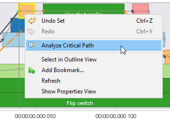
Performs critical path analysis on the selected element, read section Critical Path Analysis for more information. If a measurement or metric instance is selected, the critical path analysis run from the end until the start-time of the interval. In other cases the critical path analysis starts at the start of the selected element and only stops at the end of the critical path. When done, the rendering strategy is changed to the critical path rendering strategy to show the critical path. The critical path is also visible in the Outline view as Scoped TMSC and can be saved using the menu. |
||
Metric‑Instance (exceeding budget) |
|
Analyze root cause |
Performs root-cause analysis on the selected metric instance, read section Root cause analysis for more information. When done, the rendering strategy is changed to the critical path rendering strategy to show the root cause analysis results. The results are also visible in the Outline view as Scoped TMSC and can be saved using the menu. |
3.4. Selection view
The Selection view tab is similar to the Outline view. It shows the model in a tree view. Clicking an element in the tree selects the element and shows the details of that element in the Properties view.
This view supports dynamic filtering based on the Outline view selection (see section dynamic inclusion filtering) to filter elements of interest.
3.5. Timed message sequence chart view
In a TMSC, the life-line of an executor is shown on as a horizontal swimlane, and (real) time is shown along the horizontal axis. The executor labels are shown on the vertical axis. The function calls that are executed by an executor are shown as bars within the swimlane. The bars are labeled with their execution name. Nested function call executions are drawn as stacked bars, resulting in a call stack. Arrows between the bars denote the data and/or control flow dependencies. The arrows indicate where executors are communicating with each other.
Due to dynamic inclusion filtering some executors might not be shown; however, the visible executors might communicate with this hidden executors. Communication text balloons are shown in this case, depending on the selected dependencies visibility. The arrow from/to the balloon indicates the data flow of the communication and the text in the balloon describes the other side.
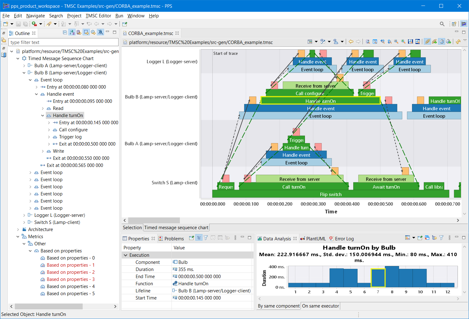
It is possible to select executions or dependencies by clicking on them, also see section Selection in Chart. Selected elements are shown with a thicker yellow border. Once selected, the details of the execution can be seen in the Properties view and in the Data Analysis view.
|
By default, the Properties view displays normal properties.
To view expert properties click the |
The Timed message sequence chart view tab supports some common functions to support analysis of its data, like:
-
Dynamic filtering based on the Outline view selection, see Section dynamic inclusion filtering.
-
Select executions and dependencies by clicking on them, see section Selection in Chart. Once selected, details can be seen in the Properties view and in the Data Analysis view.
-
Measuring the time between executions, see Section Measure Time.
-
Synchronize the current visible time window with all other supported editors, see Section Synchronize Timing.
-
Place a bookmark at a specific area within a file.
-
Saving a snapshot of the chart, see Section Export chart to PNG file.
-
Panning and zooming, see Section Panning and Zooming.
On top of these common functions, the TMSC tab has the following additional action bar buttons.
| Icon | Action | Description |
|---|---|---|
Select Rendering Strategy |
Changes the appearance of the TMSC depending on the analysis that is applied to the TMSC.
Please read section Rendering strategies for more information. |
|
Select Dependencies Visibility |
|
|
Select Executions Visibility |
|
|
|
Optimize |
"Optimize" the life-line order of the TMSC view. This groups the life-lines by minimizing the distance in the graph of messages for the visible time range. The button moves the life-lines only when pressed. When the time range is moved, the optimization action can be re-applied. |
3.5.1. Rendering strategies
Rendering strategies allow to visualize TMSCs from different viewpoints to support tailored user feedback for different analyses. When just viewing a TMSC, different colors and strokes for executions and dependencies might help the user to better understand their domain, whereas for, e.g., critical path analysis it is important that the dependencies on the critical path are highlighted. The rendering strategies in PPS are flexible and extendible (as described in the developer guide).
| Performing an analysis may change the applied rendering strategy. Please use the rendering strategy toolbar button to go back to the previous rendering strategy if needed. |
| Icon | Name | Description |
|---|---|---|
Based on properties |
This rendering strategy is typically used together with the TMSC textual editor.
This strategy will render the TMSC elements based on properties that are added to the TMSC model.
Please read the comments that are included in the |
|
Critical Path |
This strategy is used to show the Critical Path Analysis and Root cause analysis results.
To learn more about these analyses and how to interpret their results, please read their corresponding sections.
|
|
Default |
This is the default rendering strategy and can be used to render any TMSC. This strategy shows all elements except life-line segments and projected dependencies. No color strategy is applied for executions, messages are dark-gray and other dependencies are light-gray. |
|
Slack |
This strategy is used to show the Slack Analysis result. To learn more about this analysis and how to interpret its results, please read the corresponding section. The strategy shows the TMSC using the default rendering strategy and adds annotations for events that indicate how much slack is allowed before that point in software becomes critical. |
3.6. PlantUML view
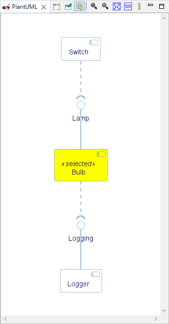
PPS includes the PlantUML Eclipse Plugin to show UML diagrams for some architecture elements in the runtime architecture of a TMSC.
When an interface is selected in the Outline view, the interface and the components that are requiring or providing the interface are shown in a component diagram.
When a component is selected in the Outline view, the component, its required and provided interfaces and the components that respectively provide or require those interfaces are shown in a component diagram.
The selected architecture element is rendered in yellow as illustrated in the figure at the right.
3.7. Data Analysis view
| To open the Data Analysis view, click the menu. |
This view can be used to perform analysis on TMSC elements like executions, messages or metrics. By selecting an element, it can be analyzed in detail. All comparable occurrences of the element will be collected and analyzed in the selected chart. What makes an element comparable, depends on the type of the element. For executions, their function and either component or executor are considered.
Apart from the standard analysis of a single element, there is also the possibility to analyze measurements. To access this function, the user must first perform a time measurement for two executions. By selecting the measurement, the execution pair can be analyzed in detail. All occurrences of execution pairs for the selected measurement will be collected and analyzed in the selected chart.
The charts in the Data Analysis view support some common functions to support analysis of their data, like:
-
Panning and zooming, see Section Panning and Zooming.
-
Saving a snapshot of the chart, see Section Export chart to PNG file.
On top of these common functions, the Data Analysis view has the following additional action bar buttons.
| Icon | Action | Description |
|---|---|---|
|
Select Data Analysis Type |
Two types of charts are available for analyzing the data, please read their corresponding sections for more information: |
|
New Data Analysis View |
If pushed, it opens another instance of the Data Analysis view. The other instance can be used to, for instance, view both the time series and histogram at the same time, or to keep one of the views pinned to a selection. |
|
Pin to selection |
If pushed, this Data Analysis view is pinned to the current selection. |
|
Filter Outliers |
If pushed, a dialog is shown that allows to remove outliers from the current data set. The following outlier detection algorithms are supported:
|
3.7.1. Time series viewer
This chart displays the durations for all comparable elements for the selected element, including the element itself. A description for the selected element is displayed in the title of the chart. Statistical information can be found just below the title of the chart: mean, standard deviation, minimum and maximum.
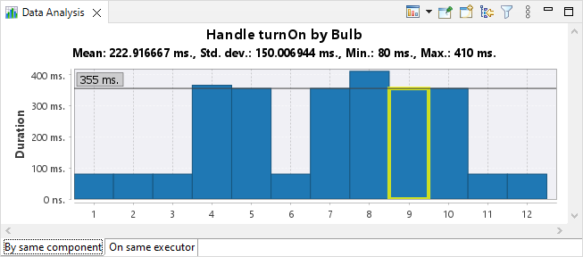
Every occurrence will be visualized as a vertical bar, with the height being equal to the duration. The occurrences are ordered 'as is', just like the order in the original data set. The originally selected element is also selected in the bar chart.
| If a metric is selected, the durations of its instances will be visualized, where red bars denote instances that exceed the metric budget. |
On top of the common Data Analysis functions, the Time Series Chart view also supports selection and the following additional action bar buttons.
| Icon | Action | Description | ||
|---|---|---|---|---|
|
Locate value |
If pushed, the current selection of the Data Analysis view is synchronized to the Outline view of the TMSC graphical viewer.
|
3.7.2. Histogram viewer
This chart displays a histogram of the durations for all comparable elements for the selected element, including the element itself. A description for the selected element is displayed in the title of the chart. Additional statistical information can be found just below the title of the chart: mean, standard deviation, minimum and maximum.
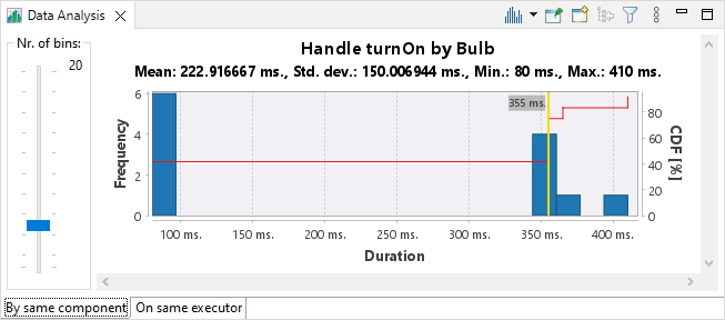
The width of the duration intervals on the x-axis can be adjusted by the user using the 'Nr. of bins' slider. The duration of the originally selected element is shown as a vertical, yellow marker. The red line shows the Cumulative Distribution Function (CDF) which shows the probability that the duration will take a value less than or equal to \$x\$. <<<
4. Common Viewer Functionality
This chapter describes functionality that is commonly available for viewers in PPS.
4.1. Panning and Zooming
The chart viewers supports zooming and panning, as follows:
-
To zoom in, click in the chart area and drag towards the right and downwards. A rectangle shows the selected area. Once the mouse is released, the chart is zoomed in, only showing the selected area.
-
Hold the Ctrl key while clicking and dragging to zoom horizontally only.
-
Hold the Ctrl+Shift keys while clicking and dragging to zoom vertically only.
-
-
To zoom out, click in the chart area and drag to the left. Release the mouse to zoom all the way out, to show the entire chart.
-
Hold the Ctrl key while clicking and dragging to zoom out horizontally only.
-
Hold the Ctrl+Shift keys while clicking and dragging to zoom out vertically only.
-
Scroll up to zoom in and scroll down to zoom out. The location of the mouse will be used as focus area, meaning that the chart will be zoomed in or out around that point.
-
Hold the Ctrl key while scrolling with mouse wheel to zoom horizontally.
-
Hold the Ctrl+Shift keys while scrolling with mouse wheel to zoom vertically.
First click somewhere in the chart to activate keyboard focus. While holding the Ctrl key, the arrow keys can be used to zoom the chart in or out. Both the normal arrow keys as well as the arrow keys on the numpad can be used.
-
Use the → or ← key to zoom in or out horizontally.
-
Use the ↑ or ↓ key to zoom in or out vertically.
In addition to the arrow keys, also 'browser style' zooming is supported.
While holding the Ctrl key:
-
Use the + key to zoom in both horizontally as vertically.
-
Use the - key to zoom out both horizontally as vertically.
-
Use the 0 key to zoom all the way out, showing the entire chart.
-
Use the vertical scroll bar or mouse wheel to scroll vertically.
-
Use the horizontal scroll bar to scroll horizontally.
Hold the Alt key while clicking and dragging the chart in the direction to pan.
First click somewhere in the chart to activate keyboard focus. The arrow keys can be used to pan the chart in the desired direction. Both the normal arrow keys as well as the arrow keys on the numpad can be used.
Right click on the chart to show a menu with even more options.
Furthermore, the action bar for time based views show additional buttons to zoom.
| Icon | Action | Description | ||
|---|---|---|---|---|
|
Zoom to fit all the data in the data set |
Zoom out to show all the data in the current view.
|
||
|
Zoom to fit all content |
Zoom out to show as much content as possible (considering performance) in the current view. |
||
|
Zoom to fit all content horizontally |
Zoom out to horizontally show as much content as possible (considering performance) in the current view. |
||
|
Zoom to fit all content vertically |
Zoom out to vertically show as much content as possible (considering performance) in the current view. |
||
|
Zoom out |
Zoom out a bit. |
||
|
Zoom in |
Zoom in a bit. |
||
|
Zoom to current selection |
This will zoom the view to show the active selection only.
|
||
|
Zoom to fit the time of the current selection |
This will zoom the view to show the time range for the active selection.
|
||
|
Zoom to fit the height of the current selection |
This will zoom the view to show the height for the active selection.
|
||
|
Back |
This will navigate back to the previous visible area in the navigation history.
|
||
|
Forward |
This will navigate forward to the next visible area in the navigation history.
|
4.2. Selection in Chart
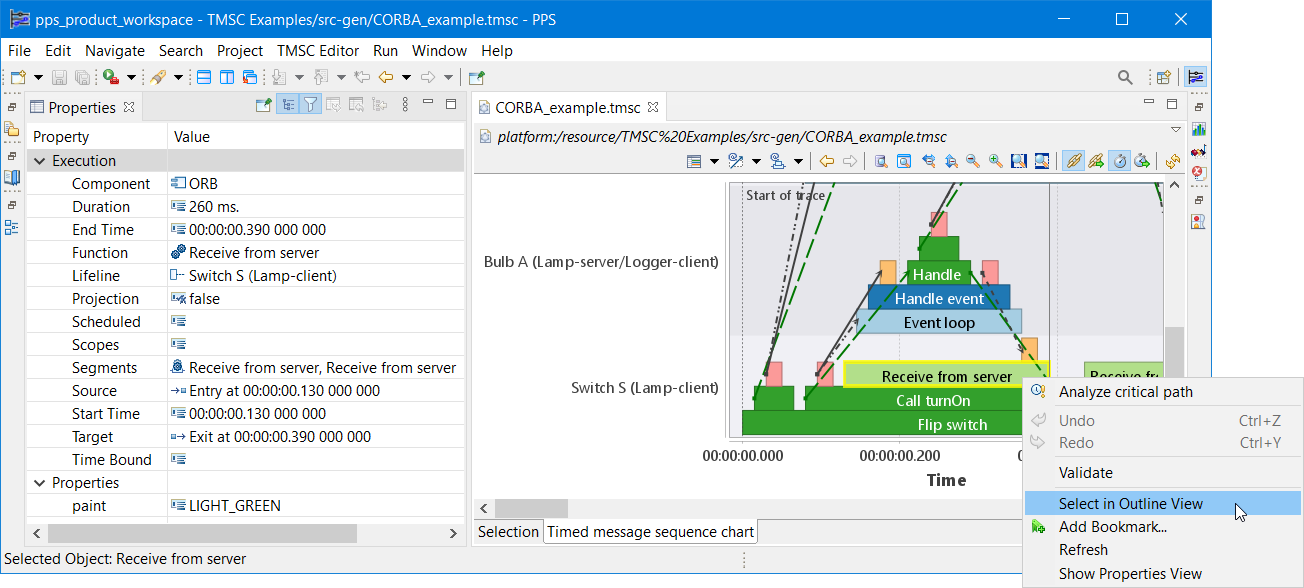
It is possible to select some of the items in a chart by clicking on them. If an item supports selection and is selected, it is shown with a thicker yellow border. Once selected, the details of the item can be seen in the Properties view.
|
By default, the Properties view displays normal properties.
To view expert properties click the |
A context menu is available to select the current chart selection in the Outline view. This might be helpful for views that support dynamic inclusion filtering.
4.3. Measure Time
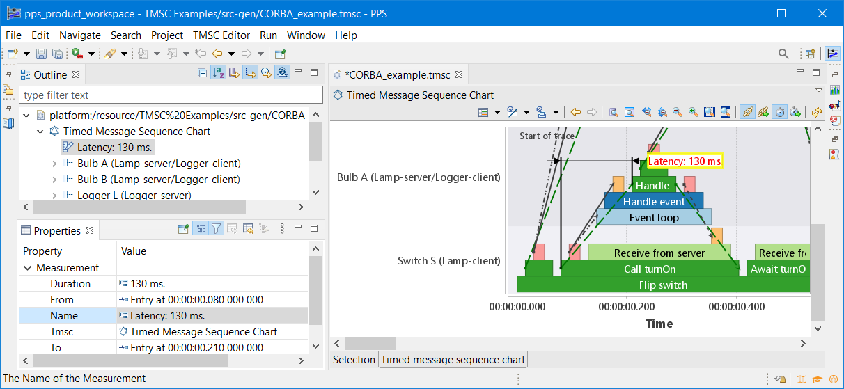
It is possible to measure the time between for instance the start of one task, and the termination of another task in a chart.
While hovering over a task, a gray vertical support line is shown.
While hovering over the first half of the task, it is shown at the creation of the task.
While hovering over the second half of the task, it is shown at the termination of the task.
Hold down the Alt key while such a support line is shown, and left click it, to keep the support line fixed at that moment in time.
Then hover to move the support line to another end point of a task and again left click while holding the Alt key.
An annotation is then shown that visually and textually shows the time between the two support lines.
The measurement is also added to the model and as shown ![]() in the Outline view and the dirty (*) state of the editor.
The user can choose to save
in the Outline view and the dirty (*) state of the editor.
The user can choose to save ![]() the measurement or to undo the operation by using the menu.
the measurement or to undo the operation by using the menu.
| To change the text of the measurement annotation, please select the annotation and edit the Name in the Properties View. |
|
To delete a measurement annotation, please select the annotation and either hit the Del key or use the |
4.4. Export chart to PNG file
It is possible to save a snapshot of a chart by clicking the Export As Image ![]() from the view menu (small triangle
from the view menu (small triangle ![]() or 3-dots
or 3-dots ![]() button at the right top of the view).
The action will open a save dialog which allows you to select the location and the name of the exported PNG file.
button at the right top of the view).
The action will open a save dialog which allows you to select the location and the name of the exported PNG file.
| The PNG is saved with the same resolution and size as currently displayed. |
4.5. Synchronize Timing
The time range in open viewers can be synchronized, so that multiple aspects on a time range as shown in the different viewers, can be analyzed simultaneously. When one editor is zoomed or scrolled, the other editors remain synchronized. This is especially helpful when editors are positioned above or 'on top of' each other. As in that case, the margins to the left and right of the time range will be synchronized as well, such that the time ranges have the same width in the viewers. The data for corresponding points in time are then vertically aligned, making it easy to correlate the data from the different viewers.
| Time range synchronization only works if the ranges of two viewers overlap. If the current visible range of a viewer is outside the range of another editor, time range synchronization behavior is unpredictable. |
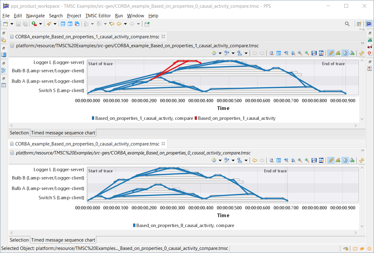
Only PPS viewers that have a time range (typically the x-axis) support time range and margin width (the width taken by the margin labels, margin ticks, etc) synchronization. If a viewer supports time range and margin width synchronization, some buttons will be present in the toolbar of the viewer.
| Icon | Action | Description |
|---|---|---|
|
Synchronize Time Range |
If pushed, the current time range of the editor/view is explicitly synchronized to all other supported editors/views that have time range synchronization enabled. |
|
Enable Time Range Synchronization |
If checked, the editor/view will participate in time range synchronization. If not checked, changes to the time range of the editor/view will not be automatically synchronized to any other editors/views, and the editor/view will not be synchronized to time range changes of other editors/views. |
|
Synchronize Margin Width |
If pushed, the current margin width of the editor/view is explicitly synchronized to all other supported editors/views that have margin width synchronization enabled. |
|
Enable Margin Width Synchronization |
If checked, the editor/view will participate in margin width synchronization. If not checked, changes to the margin width of the editor/view will not be automatically synchronized to any other editors/views, and the editor/view will not be synchronized to margin width changes of other editors/views. |
Currently, PPS viewers do not support manually changing the margin width.
As such, the margin width is only synchronized by explicit request, using the Synchronize Margin Width toolbar button (![]() ).
To reset the margin width of an editor/view, click the Refresh toolbar button (
).
To reset the margin width of an editor/view, click the Refresh toolbar button (![]() ).
).
Disabling time range and margin width synchronization can be useful when dealing with large traces.
Zooming in to a specific part of a trace while having time range synchronization enabled may lead to performance issues.
To mitigate this, disable time range synchronization on a view, zoom in to the time range of interest within that view, re-enable time range synchronization for the view, and press the Synchronize Time Range toolbar button (![]() ) to explicitly synchronize the new time range to the other views.
That way, the other views are only updated once.
) to explicitly synchronize the new time range to the other views.
That way, the other views are only updated once.
Time range and margin width synchronization are performed per workbench window. If you open a second workbench window, the editors/views within each workbench window are synchronized. Editors/views across different workbench windows are not synchronized. This is helpful when looking at different traces in separate workbench windows.
4.6. Splitting and cloning editors
Some editors have multiple tabs, where each tab has a different view on the same data. It can be useful to have multiple editors on the same data, to show different views on the same data, at the same time. To support this, editors can be split and cloned.
When an editor has the focus, the following toolbar buttons are present in the toolbar:
| Icon | Action | Description |
|---|---|---|
|
Toggle Split Editor (Horizontal) |
If pushed, the editor is split into two parts, each shown horizontally, one above the other. Splitting horizontally while already split vertically, changes the vertical split into a horizontal split. Splitting horizontally while already split horizontally, undoes the horizontal split. |
|
Toggle Split Editor (Vertical) |
If pushed, the editor is split into two parts, each shown vertically, one besides the other. Splitting vertically while already split horizontally, changes the horizontal split into a vertical split. Splitting vertically while already split vertically, undoes the vertical split. |
|
Clone Editor |
If pushed, the editor is cloned. A second instance of the editor is then available that can be used independently of the original editor. |
When splitting, the two editors remain bound together, and can only be moved together. The split can later be undone. When cloning, the two editors can be independently moved, closed, etc.
Putting two editors below each other can be especially useful when applying timing synchronization to the views of those editors.
4.7. Multiple workbench windows
By default the Eclipse IDE opens with one window, called the workbench window. Working with traces, various editors may be opened, typically on data that is related. When working with with multiple traces, especially when using multiple monitors, it can be of benefit to open a second workbench window. In this second workbench window, editors for a different trace can be opened, and analyzed. This keeps the editors/data for one trace in one window, separate from the editors/data of the other trace in the other window. The data for the different traces in the workbench windows on the different monitors can then for instance be compared. Also, timing synchronization is applied per workbench window. To open a new workbench window, click the menu.

4.8. Dynamic Inclusion Filtering
Typically PPS works with large data sets. This complicates focussing on relevant data and the following functions therefore have been added to the Outline view.
| Icon | Action | Description |
|---|---|---|
|
type filter text |
Dynamic filtering of its elements, by means of entering a search pattern in its filter text box. The pattern may contain '*' for 0 and many characters and '?' for exactly one character. Literal '*' and '?' characters must be escaped in the pattern e.g., '\*' means literal '*', etc. Escaping any other character (including the escape character itself), just results in that character in the pattern. e.g., '\a' means 'a' and '\\' means '\' |
|
Push Context |
If checked and one or more elements are selected, the selected elements are set as input for the active editor. The editor will threat this input as it context and show the most relevant information accordingly. |
|
Push Selection |
If checked and one or more elements are selected, the selected elements are also highlighted in the active editor. |
|
Push Time Range |
If checked and one or more elements are selected, the time range to show these elements is calculated and is set to the active editor. |
5. Release Notes
The release notes of the Platform Performance Suite (PPS) are listed below, in reverse chronological order.
5.1. PPS v0.30
The highlights of this release are:
-
Support CPU info in TMSC models.
-
CPU info can be stored on
LifelineSegment, using persisted properties. -
A rendering strategy is available to view the CPU information.
-
The Data Analysis View shows CPU info for the selected execution.
-
-
TMSC syntax now supports running analyses automatically.
-
This release also includes bug fixes and improvements.
-
Eclipse 2020-06 → Eclipse 2024-09
-
Eclipse LSAT v0.3 → Eclipse LSAT v0.5
-
Eclipse TRACE4CPS v0.2 → Eclipse TRACE4CPS v0.3
-
Eclipse JustJ 11 → Eclipse JustJ 21
5.2. PPS v0.20
This release prepares PPS to be open sourced.
The highlights of this release are:
-
TMSC meta-model changes, see developer guide for more information:
-
Added
Hostconcept to the deployed architecture life-cycle phase. -
Executionsare notDependenciesanymore. -
Added
ITimeRangeinterface to support time-based selections.
-
-
This release also includes many bug fixes and improvements.
5.3. PPS v0.0.3
The highlights of this release are:
-
Upgrade from Eclipse 2020-06 to Eclipse 2021-12, see New and Noteworthy for more information.
-
Reuse common libraries from Eclipse TRACE4CPS™ and Eclipse LSAT™
-
PPS RCP now packages a JavaSE-11 JRE
-
This release also includes many bug fixes and improvements.
5.4. PPS v0.0.2
This release of PPS adds the feature of defining, resolving and analyzing metric instances in a TMSC. When a metric instance exceeds its budget, a detailed root cause analysis can be performed to diagnose which task(s) caused this.
5.5. PPS v0.0.1
This first release of PPS includes a TMSC graphical viewer that is supported by a textual syntax.
